Your favorite color can be linked to various personality traits, motivation, and productivity levels in your life.
Color is everywhere and we need to know the psychological effect of color. Color psychology has been used in marketing and branding for years, but research in the last decade has taken color psychology and applied it to human personality traits.
Various studies across multiple years have given us insight into what each color represents in regards to our personality, work ethic, and motivation levels.
Many people are unaware of the impact colors have on our thoughts, emotions, and behaviors in everyday life.
It’s extremely likely that you have purchased something in a store or chosen one product over another due to what brands call color marketing: targeting brands, colors, and adverts based on colors that will influence you to buy.
Color psychology is being used around us every single day and not only in what brands we buy, but also in how we react to our environment.
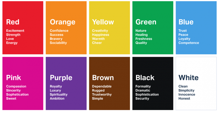
Color personality based on color psychology.
Red
Being the longest wavelength, red is a powerful color. Although not technically the most visible, it has the property of appearing to be nearer than it is and therefore it grabs our attention first. Hence its effectiveness in traffic lights the world over. Red is a bold color choice that’s been associated with excitement, passion, danger, thrill, energy, and action. You may notice that some brands use red for their “call to action” buttons (“order now,” “shop now,” etc.). This is because red is an intense color that is able to provoke strong emotions which can encourage you to buy things.
Orange
Since it is a combination of red and yellow, orange is stimulating and reaction to it is a combination of the physical and the emotional. It focuses our minds on issues of physical comfort – food, warmth, shelter etc. – and sensuality. Orange is often representative of creativity, happiness, freedom, success, and the balance that brings it all together. Marketers may use this color to draw your attention to a catchy heading or important note on their website (many “alerts” are orange to catch your eye) —but orange isn’t nearly as bold and enticing as red.
Yellow
The yellow wavelength is relatively long and essentially stimulating. In this case the stimulus is emotional, therefore yellow is the strongest color, psychologically. The right yellow will lift our spirits and our self-esteem; it is the color of confidence and optimism. Happiness, positivity, and warm summer sun is what yellow reminds us of. Brands may use a splash of yellow in their logo to make you feel happy when you see their products. Many “free shipping” icons on websites may be yellow to attract you to something that is cheerful and positive.
Purple
Purple can be connected to royalty, power, privilege, wisdom, and spirituality. Purple can be something of a frustrating color as well, as it can cause feelings of frustration or be perceived as arrogant – this is why websites and brands (Hallmark, Yahoo) will use a splash of purple or mix purple with a warmer tone such as white.
Pink
Being a tint of red, pink also affects us physically, but it soothes, rather than stimulates. (Interestingly, red is the only color that has an entirely separate name for its tints. Tints of blue, green, yellow, etc. are simply called light blue, light green etc.) Pink is often associated with femininity, playfulness, and love, but pink can also be perceived as a somewhat immature color. You will notice a lot of pink in a child’s toy packaging or brands to signal playful, whimsical fun. Other brands (Victoria Secret for example) have signified the color to mean something cute, fun, playful and sexy.
Black
Black is all colors, totally absorbed. The psychological implications of that are considerable. It creates protective barriers, as it absorbs all the energy coming towards you, and it enshrouds the personality. Black is essentially an absence of light, since no wavelengths are reflected and it can, therefore be menacing; many people are afraid of the dark. Black can mean so many different things: boldness, uniqueness, mystery, intrigue, and power. But it can also mean unhappiness, darkness, sadness, pain, or grief. Black is associated with death and mourning, but can also be associated with strength, luxury, and intensity.
White
Just as black is total absorption, so white is total reflection. In effect, it reflects the full force of the spectrum into our eyes. Thus it also creates barriers, but differently from black, and it is often a strain to look at. It communicates, “Touch me not!” . White is often associated with purity – in Western cultures, white is for weddings and hospitals, often signifying purity, cleanliness, and order. Brands will often add a splash of white or use white to offset more intense colors (such as red).
Blue
Blue is the color of the mind and is essentially soothing; it affects us mentally, rather than the physical reaction we have to red. Strong blues will stimulate clear thought and lighter, soft blues will calm the mind and aid concentration. Consequently it is serene and mentally calming. It is the colour of clear communication. Blue objects do not appear to be as close to us as red ones. Blue color is stable, harmonious, peaceful, and trustworthy. Brands who want to be most well-known for their durability, strength, or reliability will use blue in their logos. Many popular computer companies (Dell and HP) and websites (Facebook, Twitter, Vimeo) are known for their predominately blue and white logos.
Green
Green strikes the eye in such a way as to require no adjustment whatever and is, therefore, restful. Being in the center of the spectrum, it is the color of balance – a more important concept than many people realize. When the world about us contains plenty of green, this indicates the presence of water, and little danger of famine, so we are reassured by green, on a primitive level. Two of the things that make the world go ’round are associated with the color green: nature and money. Green color can signify growth, fertility, health, wealth, wellness, or generosity. Green can also be associated with negative connotations such as jealousy or envy.
Brown
Brown usually consists of red and yellow, with a large percentage of black. Consequently, it has much of the same seriousness as black, but is warmer and softer. It has elements of the red and yellow properties. Brown has associations with the earth and the natural world. It is a solid, reliable color and most people find it quietly supportive – more positively than the ever-popular black, which is suppressive, rather than supportive.
Credit: www.aceola.com